...
Administrators using the console are able to create customized graphs. They are able to specify which statistic to be on which axisgraphed, in addition to the ability to perform a mathematical operation on two statistics.
Graphs can be added for a specific statistic by either selecting the statistic while viewing a server as previously mentioned, or by selecting the Add Graph from the monitoring console main page.
Once on the graph adding page, the server must first be selected, followed by the MBean and the statistic to be graphed, and a Timeframe, which is the duration that will be graphed (most recent 60 minutes, for example). After this, a math operation can be selected from presets (basic addition, multiplication, subtraction or division), or by selecting 'other' to custom define one. Once a math operation is defined (which is optional), an optional secondary statistic can be selected as well.
X and Y axis labels, as well as the description and name must be manually defined.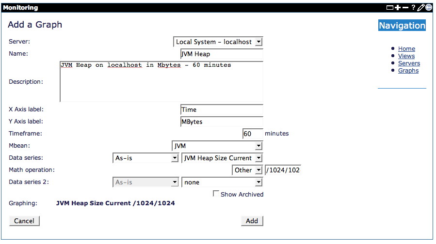
Once all of this information is provided, simply click 'Add' to add the graph to the database.
After the graph is added, the browser will be redirected to the main monitoring console page, where selecting the name of the graph will open a pop-up window displaying the graph as follows:

Views
Since there may be many different graphs, the concept of a "view" is used to bundle related graphs together for more manageable use. For example, all graphs related to a specific server can be bundled together, or all graphs graphing the throughput of servers.