Scope
Required:
- An AOO Logo
Considerations:
- Can be altered for use in splash screens, about screens, publications, website, elements in application icons, etc.
Current Logo
![]()
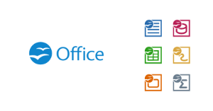
All - Full Logo
Blue - Symbol, represents the brand in tight layout areas and icons.
Red - Apache reference.
Green + Red - Wordmark.
Criteria For Logo
There are three criteria for logo proposals.
Primary Requirements must be satisfied in order to be considered, it will be disqualified until it is remedied.
Secondary Considerations are nice to haves, a logo proposal can have none of these yet can be a perfectly fine proposal.
Restrictions must not be satisfied, it will be disqualified until it is remedied.
Primary Requirements:
- Logo submissions must include the source.
- Logo must be come in two flavors, a full logo (Symbol + Wordmark) and condensed logo (normally fits in a square, symbol).
- Logos can be as large as the designer wishes, but must be able to scale down and not loose detail. eg. for website, splash screen, etc.
- Although text in the logo is optional, any font used must be a free and open font. eg. SIL Open Source Fonts. Any font used in the logo must be disclosed upon submission.
- Incorporation of gulls literally, symbolically or idea, but not necessarily the existing shape used in current branding.
Secondary Considerations:
- Can be easily altered for appending an application version, "Apache OpenOffice 4"
- Can be altered for use in splash screens, about screens, publications, website, elements in application icons, etc.
Restrictions:
- Cannot use proprietary fonts.
- Cannot resemble other productivity software branding that exist on the market.
- Cannot closely resemble other logo and trademarks by other organizations. eg. gold colored arches, single swoosh, blue thumb up
- Cannot use the Apache logos or other registered trademarks.
Current Proposals
May be unfinished work. These may still be pending review to meet the above requirements.
Click thumbnails to enlarge,
1. Michael Acevedo (12-15-2012)

2. Michael Acevedo (12-15-2012)

3. Michael Acevedo (31-01-2013)

4. Carl Marcum

5. Robin Fowler (31-01-2013)

6. Samer Mansour (02-01-2013)

7. Chris R. (02-02-2013)
8. Can Ünlüsoy (05-04-2013)

9. Nikita Fernandez

3 Comments
Kay Schenk
There is some great creative work here! Perhaps we should bear in mind that the "logo" itself (without version number) might need to be used on other marketing materials – brochures, clothing etc. But perhaps this will come out in further voting/discussion. And, would the new logo lend itself to such uses.
Samer Mansour
The reason I think flat is in right now is because many social sites are leading the way in clean uniform UIs. If your company logo is complicated it looks upsetting on those platforms/apps. Flat is "in" because of this in my opinion.
Facebook, Google+, Twitter, Specially Windows 8 Metro Tiles, Android, Even iOS to a degree, a flat logo looks better on these platforms.
Its not just how great the logo looks in the splash screen, but in print, platforms and other media.
Kalle Hauser
I prefer the old orb-icon instead of a squared one. The current Logo looks fresh and modern but not overloaded.
The design from Chris R. is a nice idea, it moves the curent logo to the minimalistic style of win 8. The font is also a good choice.
I like the font-style and color from Carl Marcum's work (and Michael Acevedo's work), but the 6 icons (writer, clac, etc.)under the wordmark could be removed.