Creative Brief
How might we update or enhance our product visual identifier/logo to best reflect our brand?
Brand Attributes
The Apache OpenOffice brand reflects the following attributes:
- global
- open
- transparent
- accessible
- clean
- strong
- leader
- approachable
- innovative
- modern
- sharp
- usable
- lightweight
Visual Elements
The following visual elements are associate with the Apache OpenOffice products:
- globe, orb, circle
- document, page, square, rectangle
- transparent materials
- letter O & O
- apache feather
- gulls, page curls
- document, book, booklet
Brainstorming
No wrong answers here, just a collection of sketches realizing the visual elements.
Kevin Grignon - Concepts


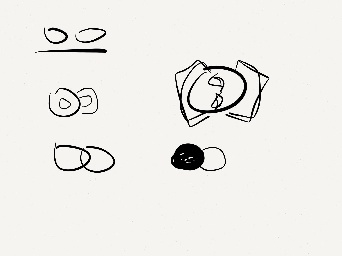


- docs
- transparent

Lucas Filho - Concepts
![]()
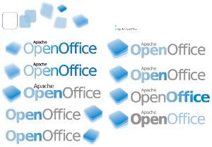
Graham Lauder - Graphical Text for Logo text
This is another example of a text graphic created in inkscape used instead of some type of typeface. It's a San Serif type font and can be modified as an svg. 
PNG version: 
Michael Acevedo - Concept Logo for AOO 4 Proposal #1 (12-15-2012)
This logo proposal changes makes use of a new font and logo scheme to present the word OpenOffice by updating the orb as a flat surface and placing a "donut" hole (which represents the open nature of AOO as an open source project) in the orb along with our trademark gulls effectively making it an "O" which anchors the words "Open" and "Office" but with the use of a single "O". The logo also makes use of a new typeface.

Michael Acevedo - Concept Logo for AOO 4 Proposal #2 (12-19-2012)
The second logo proposal for Apache OpenOffice 4 is more conservative, conventional, and simplistic than the previous logo proposal; which makes the new open office logo more recognizable among the community. The new logo proposal makes use of an updated OpenOffice orb which now rests on four squares that represents the four main applications associated with an office suite (Blue= Writer, Green= Calc, Orange= Impress, and Violet= Base). In addition the orb now is surrounded by a white belvel emboss ring that makes the logo look more like a pin and actually makes it stand out of the four background squares
. 
Michael Acevedo - Concept Logo for AOO 4 Proposal #3, 4, 5, 6, and 7 (12-20-2012)
Below there are 5 additional logos for the Apache OpenOffice project, all of these follow a similar language to logo proposal 2. 

JZA#display/~jza - AOO 4 Logo proposal
A design quite different from the Gulls and even the parameters used. The logo applies more basic elements with a second version that is more complex. It tries to emulate some symbolism of continuity and dynamic evolution. Is not meant to be a finished design but the inspiration to think different about logos and image of the product.

A more complex version with something that is between feathers or the flow of water. It add some dynamism and speed to the continuity symbol.

Some suggestions on improving the fonts and color combination has already been contributed. A more rounded and contrasting font might improve the impact of the logo.
Michael Acevedo - Concept Logo for Apache OpenOffice 4.0 Proposals #8 and #9 (12-26-2012).
The designs below are the eight and ninth versions of my proposal logos for the Apache OpenOffice 4.0 logo. This new design does away with the orb and changes it for a gull ring that rests under a blue background which itself rests on circles which are inspired on the Adobe Flex logo multicolor scheme. The new gull ring while being new retains the familiar circular shape of the current OpenOffice logo, but at the same time is a new take that pays respect to the orb. All of these elements are wrapped in a modern black gradient icon than makes the logo stand out. Furthermore, the new logo actually changes the look of the word OpenOffice (also an inspiration from the Adobe Flex project logo) into a more modern non-capitalized "openoffice" design. The latter serves the function of highlighting Apache as the owner of the project (whose name is in capital letters), yet the non-capitalized "openoffice" names takes presence by being written in a larger size font. Overall, the new logo design is simple, clean, and modern.
Below there are two designs, the first one (top) is the proposed official logo for the project and the second logo (bottom) has a slightly smaller icon that is geared toward website header use and banners.

Robin Fowler - Logo proposal OpenOffice 4 (01-31-2013)
The gulls in this logo are aligned to form the shape of a book. On one of the pages there's text (writer) and the other there's a spreadsheet (calc). The font used is the Bitstream Vera. The feather is white like the gulls, the reason for not using the apache brand feather is simply that it doesn't really match the design.
![]()
Notes
- consider a logo content, as seen in Flex
- Apache OpenOffice is a continuation of OpenOffice.org, consider retaining aspects of previous OpenOffice logo for continuity
- consider including Apache in logo
Test
Sample document attachment: sample_document.odt
Carl Marcum - Rough Concept Logo for Apache OpenOffice 4.0
This is a rough draft of my thoughts for a logo. Borrowing the text portion from Michael Acevedo's proposal and the 3.4 orb.
Colors are added as a bar beneath text. The "S" shapes ends of the colors are from the icons (Sun styling I think?).
The colors could be attached together and gradient applied maybe.
I hope if someone likes this they can pursue it further as I'm not an artist ![]()